If we decided to turn back the clock half a century, America’s grocery shelves and neon-lit highways would look very different. And while many of our favorite brands have been around for decades, only a few of their consumers know that their appearance has definitely evolved. Mascots come and go, and colors and fonts change. But some companies, such as Coca-Cola and Kellogg’s, have used the same font for decades. So, here are some of the most famous names in business, snacks, and pop culture as they looked in the 1960s. Do you prefer the vintage or modern logo?
Burger King
Though McDonald’s is widely regarded as the undisputed king of fast-food burgers, Burger King has been a long-time contender. The home of the flame-broiled Whopper, founded in 1954, serves 11 million customers daily. But did you know that the original Burger King Whopper was just 29 cents?
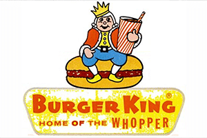
The Whopper, which debuted in 1957, was a quarter-pound, oversized burger served on a massive five-inch bun for a reasonable 29 cents. While that may appear to be a bargain, it was twice the price of competitors’ 15-cent burgers.